2 Data Visualization
Author: Alicia Johnson
The following data set on the 2016 election is stored as a csv file at https://www.macalester.edu/~ajohns24/Data/electionDemographics16.csv:
This data set combines the county level election results provided by Tony McGovern (shared on github), county level demographic data from the df_county_demographics data set within the choroplethr R package, and historical information about red/blue/purple states. Let’s take a quick look:
# Use read.csv() to import the csv file
election <- read.csv("https://www.macalester.edu/~ajohns24/Data/electionDemographics16.csv")
# Check it out!
dim(election) # dimensions
head(election, 2) # first 2 rows
names(election) # variable names
Now that we understand the structure of this data set, we can start to ask some questions:
- To what degree did Trump support vary from county to county?
- In what number of counties did Trump win?
- What’s the relationship between Trump’s 2016 support and Romney’s 2012 support?
- What’s the relationship between Trump’s support and the “color” of the state in which the county exists?
Visualizing the data is the first natural step in answering these questions. Why?
- Visualizations help us understand what we’re working with: What are the scales of our variables? Are there any outliers, i.e. unusual cases? What are the patterns among our variables?
- This understanding will inform our next steps: What statistical tool / model is appropriate?
- Once our analysis is complete, visualizations are a powerful way to communicate our findings and tell a story.
2.1 ggplot
We’ll construct visualizations using the ggplot function in RStudio. Though the ggplot learning curve can be steep, its “grammar” is intuitive and generalizable once mastered. The ggplot plotting function is stored in the ggplot2 package:
library(ggplot2)The best way to learn about ggplot is to just play around. Don’t worry about memorizing the syntax. Rather, focus on the patterns and potential of their application. There’s a helpful cheat sheet for future reference:
2.2 Univariate visualizations
We’ll start with univariate visualizations.
Categorical Variables
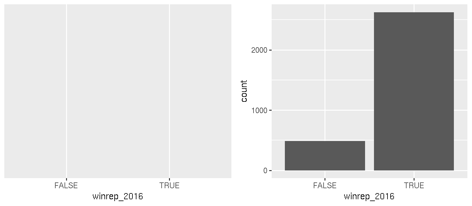
Consider the categorical winrep_2016 variable which indicates whether Trump won the county:
levels(factor(election$winrep_2016))
## [1] "FALSE" "TRUE"
A table provides a simple summary of the number of counties that fall into these 2 categories:
table(election$winrep_2016)##
## FALSE TRUE
## 487 2625A bar chart provides a visualization of this table. Try out the code below that builds up from a simple to a customized bar chart. At each step determine how each piece of code contributes to the plot.
# Set up a plotting frame
ggplot(election, aes(x = winrep_2016))

# Add a layer with bars
ggplot(election, aes(x = winrep_2016)) +
    geom_bar()
In summary:
Quantitative Variables
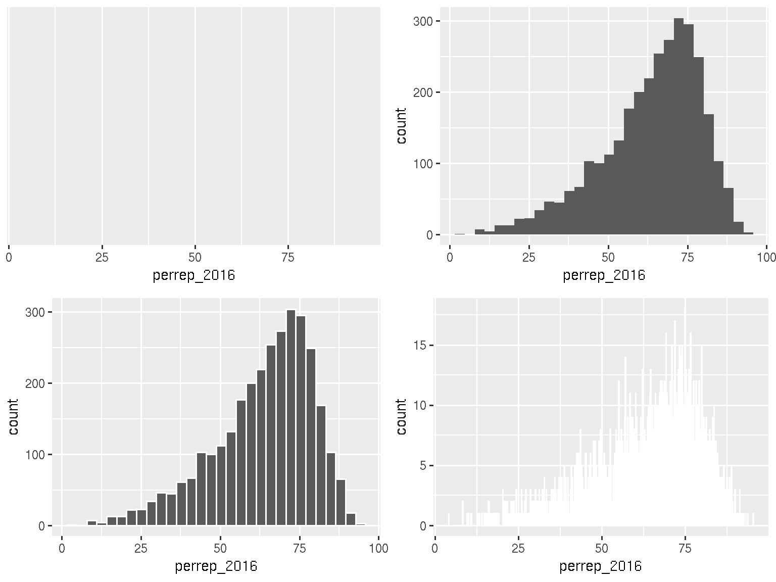
The quantitative perrep_2016 variable summarizes Trump’s percent of the vote in each county. Quantitative variables require different summary tools than categorical variables. We’ll explore 2 methods for graphing quantitative variables: histograms & density plots.
Histograms are constructed by (1) dividing up the observed range of the variable into ‘bins’ of equal width; and (2) counting up the number of cases that fall into each bin. Try out the code below.
# Set up a plotting frame
ggplot(election, aes(x = perrep_2016))

# Add a histogram layer
ggplot(election, aes(x = perrep_2016)) +
    geom_histogram()

# Change the border colors
ggplot(election, aes(x = perrep_2016)) +
    geom_histogram(color = "white")

# Change the bin width
ggplot(election, aes(x = perrep_2016)) +
    geom_histogram(color = "white", binwidth = 0.10)
In summary:
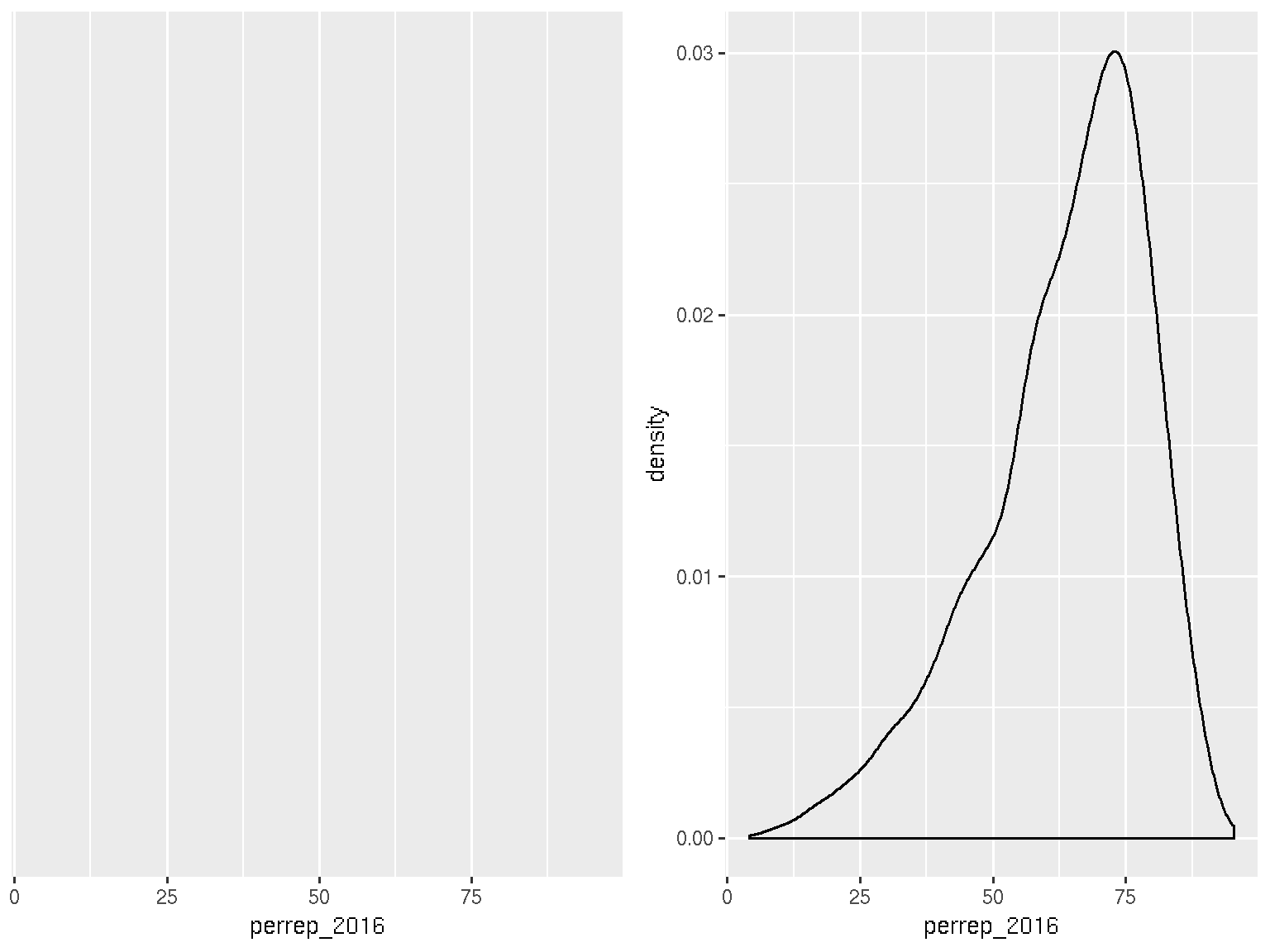
Density plots are essentially smooth versions of the histogram. Instead of sorting cases into discrete bins, the “density” of cases is calculated across the entire range of values. The greater the number of cases, the greater the density! The density is then scaled so that the area under the density curve always equals 1 and the area under any fraction of the curve represents the fraction of cases that lie in that range.
# Set up the plotting frame
ggplot(election, aes(x = perrep_2016))

# Add a density curve
ggplot(election, aes(x = perrep_2016)) +
    geom_density()
In summary:
2.3 Visualizing Relationships
Consider the data on just 6 of the counties:
Before constructing graphics of the relationships among these variables, we need to understand what features these graphics should have. Without peaking at the exercises, challenge yourself to think about how we might graph the relationships among the following sets of variables:
perrep_2016vsperrep_2012perrep_2016vsStateColorperrep_2016vsperrep_2012andStateColor(in 1 plot)perrep_2016vsperrep_2012andmedian_rent(in 1 plot)
Run through the following exercises which introduce different approaches to visualizing relationships.
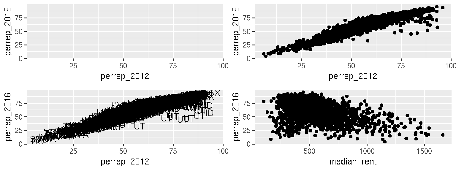
Scatterplots of 2 quantitative variables
Each quantitative variable has an axis. Each case is represented by a dot.
# Just a graphics frame
ggplot(election, aes(y = perrep_2016, x = perrep_2012))

# Add a scatterplot layer
ggplot(election, aes(y = perrep_2016, x = perrep_2012)) +
    geom_point()

# Add a scatterplot layer: label by state
ggplot(election, aes(y = perrep_2016, x = perrep_2012)) +
    geom_text(aes(label = abb))

# Another predictor
ggplot(election, aes(y = perrep_2016, x = median_rent)) +
    geom_point()
In summary:
Side-by-side plots of 1 quantitative variable vs 1 categorical variable
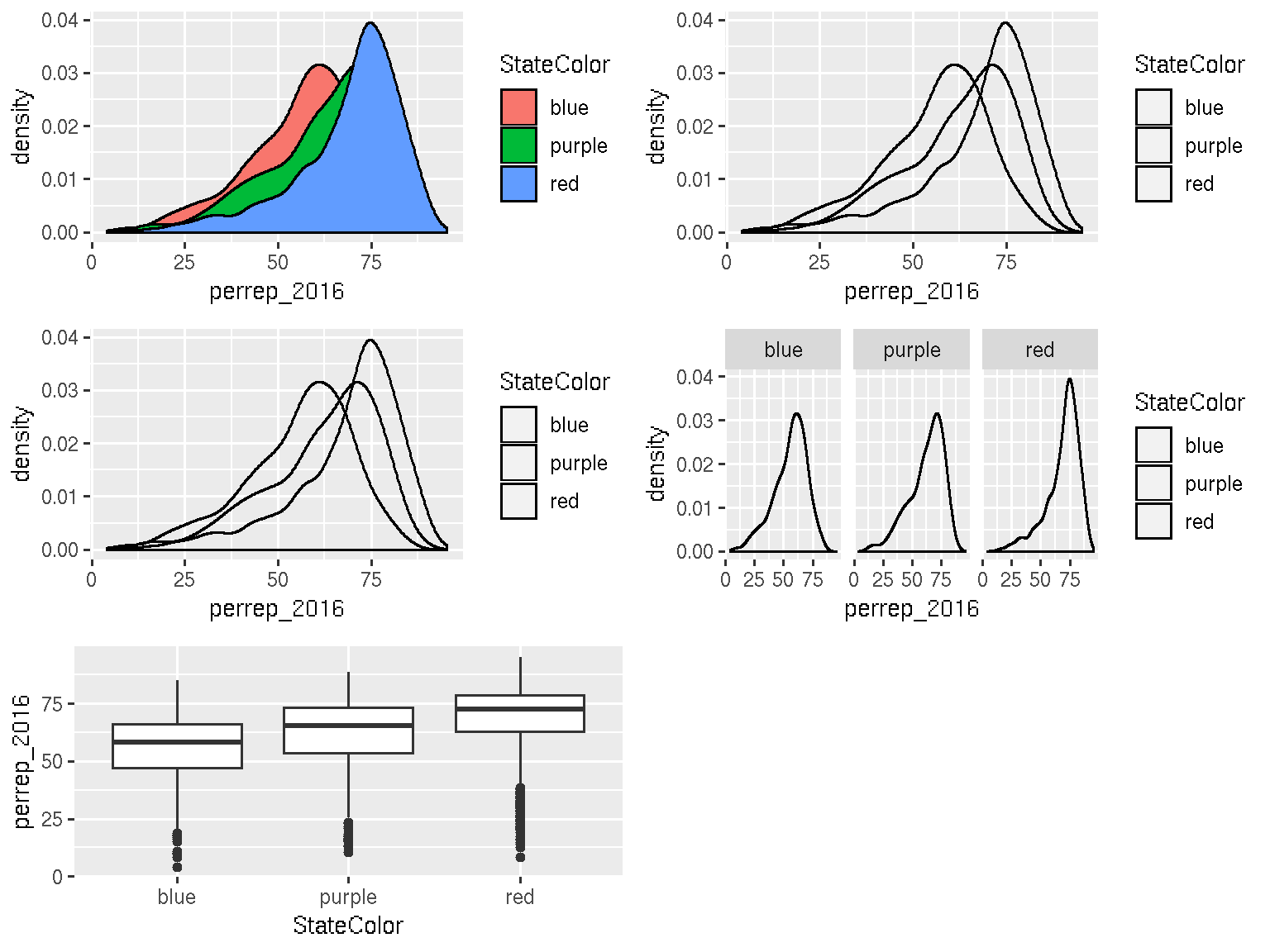
# Density plots by group
ggplot(election, aes(x = perrep_2016, fill = StateColor)) +
    geom_density()

# To see better: add transparency
ggplot(election, aes(x = perrep_2016, fill = StateColor)) +
    geom_density(alpha = 0.5)

# Fix the color scale!
ggplot(election, aes(x = perrep_2016, fill = StateColor)) +
    geom_density(alpha = 0.5) +
    scale_fill_manual(values = c("blue","purple","red"))

# To see better: split groups into separate plots
ggplot(election, aes(x = perrep_2016, fill = StateColor)) +
    geom_density(alpha = 0.5) +
    facet_wrap( ~ StateColor) +
    scale_fill_manual(values=c("blue","purple","red"))


# Or use boxplots!
ggplot(election, aes(x = StateColor, y = perrep_2016)) +
  geom_boxplot()
In summary:
Scatterplots of 1 quantitative variable vs 1 categorical & 1 quantitative variable
If median_rent and StateColor both explain some of the variability in perrep_2016, why not include both in our analysis?! Let’s.
# Scatterplot: id groups using color
ggplot(election, aes(y = perrep_2016, x = median_rent, color = StateColor)) +
    geom_point(alpha = 0.5)

# Fix the color scale!
ggplot(election, aes(y = perrep_2016, x = median_rent, color = StateColor)) +
    geom_point(alpha = 0.5) +
    scale_color_manual(values = c("blue","purple","red"))

# Scatterplot: split/facet by group
ggplot(election, aes(y=perrep_2016, x=median_rent, color=StateColor)) +
    geom_point(alpha=0.5) +
    facet_wrap( ~ StateColor) +
    scale_color_manual(values=c("blue","purple","red"))
In summary:
Plots of 3 quantitative variables
# Scatterplot: represent third variable using color
ggplot(election, aes(y = perrep_2016, x = median_rent, color = perrep_2012)) +
    geom_point(alpha = 0.5)

# Scatterplot: represent third variable using size
ggplot(election, aes(y = perrep_2016, x = median_rent, size = perrep_2012)) +
    geom_point(alpha = 0.5)

# Scatterplot: discretize the third variable
ggplot(election, aes(y = perrep_2016, x = median_rent, color = cut(perrep_2012,3))) +
    geom_point(alpha = 0.5)
In summary:
2.4 Exercises
Recall the US_births_2000_2014 data in the fivethirtyeight package:
library(fivethirtyeight)
data("US_births_2000_2014")
In the previous activity, we investigated the basic features of this data set:
dim(US_births_2000_2014)
## [1] 5479    6
head(US_births_2000_2014, 2)
## # A tibble: 2 x 6
##    year month date_of_month date       day_of_week births
##   <int> <int>         <int> <date>     <ord>        <int>
## 1  2000     1             1 2000-01-01 Sat           9083
## 2  2000     1             2 2000-01-02 Sun           8006
names(US_births_2000_2014)
## [1] "year"          "month"         "date_of_month" "date"
## [5] "day_of_week"   "births"
levels(factor(US_births_2000_2014$day_of_week))
## [1] "Sun"   "Mon"   "Tues"  "Wed"   "Thurs" "Fri"   "Sat"
Let’s graphically explore these variables and the relationships among them! Solutions are below. NOTE: This set of exercises is inspired by the work of Randy Pruim for the MAA statPREP program.
First, let’s focus on 2014:
only_2014 <- subset(US_births_2000_2014, year == 2014)Construct a univariate visualization of
births. Describe the variability in births from day to day in 2014.The time of year might explain some of this variability. Construct a plot that illustrates the relationship between
birthsanddatein 2014. NOTE: Make sure that births, our variable of interest, is on the y-axis and treatdateas quantitative.One goofy thing that stands out are the 2-3 distinct groups of points. Add a layer to this plot that explains the distinction between these groups.
There are some exceptions to the rule in exercise 3, ie. some cases that should belong to group 1 but behave like the cases in group 2. Explain why these cases are exceptions - what explains the anomalies / why these are special cases?
Next, consider all births from 2000-2014. Construct 1 graphic that illustrates births trends across all of these years.
Finally, consider only those births that occur on Fridays:
only_fri <- subset(US_births_2000_2014, day_of_week=="Fri")Define a new variable
fri13that indicates whether the case falls on a Friday in the 13th date of the month:only_fri$fri13 <- (only_fri$date_of_month == 13)Construct and comment on a plot of that illustrates the distribution of births among Fridays that fall on & off the 13th. Do you see any evidence of superstition?
SOLUTIONS:
# 1
only_2014 <- subset(US_births_2000_2014, year == 2014)
ggplot(only_2014, aes(x = births)) +
  geom_histogram(color = "white")
ggplot(only_2014, aes(x = births)) +
  geom_density()

#2
ggplot(only_2014, aes(y = births, x = date)) +
  geom_point()

#3
ggplot(only_2014, aes(y = births, x = date, color = day_of_week)) +
  geom_point()
ggplot(only_2014, aes(y = births, x = date)) +
    geom_text(aes(label = day_of_week))

#4
#HOLIDAYS!  For example, Thanksgiving is a Thursday in late November

#5
ggplot(US_births_2000_2014, aes(y = births, x = date, color = day_of_week)) +
  geom_point()

#6
only_fri <- subset(US_births_2000_2014, day_of_week=="Fri")
only_fri$fri13 <- (only_fri$date_of_month == 13)
ggplot(only_fri, aes(x = births, fill = fri13)) +
  geom_density(alpha = 0.5)
ggplot(only_fri, aes(y = births, x = fri13)) +
  geom_boxplot()
2.5 Extra
We’ve covered some basic graphics. However, different types of relationships require different visualization strategies. For example, there’s a geographical component to the election data. If you have time, try to construct some maps of the election related variables. To this end, you’ll need to install the choroplethr and choroplethrMaps packages:
install.packages("choroplethr", dependencies = TRUE)
install.packages("choroplethrMaps", dependencies = TRUE)library(choroplethr)
library(choroplethrMaps)
# Make a map of Trump support
election$value <- election$perrep_2016
county_choropleth(election)
# A map of Trump wins
election$value <- election$winrep_2016
county_choropleth(election)
# Try another variable of interest to you!!